How to Match Your Napkin Color Palette to Seasonal Wildflowers Now
· Samantha Jones
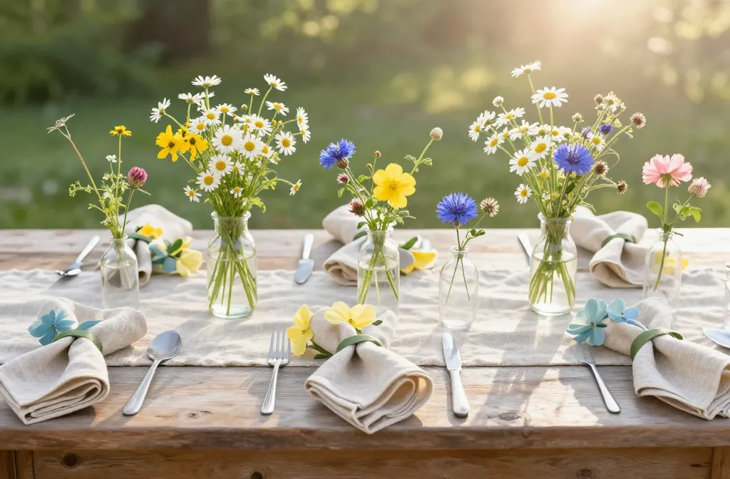
I learned the hard way that a table can look “off” even when every single piece is pretty. The fix wasn’t nicer linens — it was aligning napkin colors with what was blooming outside that week. Once I started planning around seasonal wildflowers, my tables looked intentional without extra spending. In this guide I’ll show you how to choose napkin colors that echo local blooms, so your table reads cohesive, fresh, and grounded in the season.
Start With What’s Blooming Near You
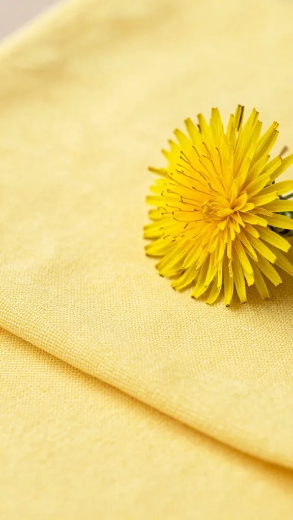
I always begin by naming three wildflowers I can actually see on a walk, in a nearby park, or at the farmers’ market. Real petals set guardrails you can trust far more than trend boards.
Take a quick phone photo and note the dominant hue, the undertone (warm or cool), and the accent shades in the center or stems. That tiny audit tells you 90% of your napkin palette.
Action today: Step outside and photograph three wildflowers you find within 10 minutes — those become your palette anchors.
Translate Petal Colors Into Napkin Neutrals, Mid-Tones, and Accents
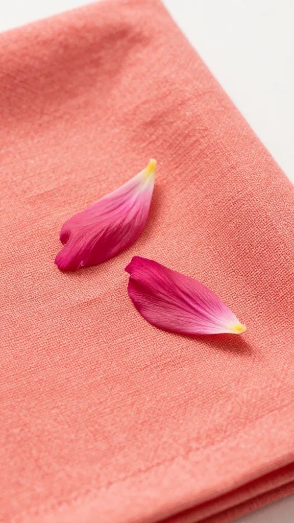
I sort colors into a simple three-part stack: a grounding neutral, a mid-tone echo of the petal, and a small pop that mirrors centers or buds. This keeps the table balanced even if plates or flowers vary.
Use this ratio: 60% neutral (tablecloth or runner), 30% mid-tone napkins, 10% accent ties/rings. If you’re skipping a tablecloth, let the wood act as the neutral and keep napkins in the mid-tone family.
Action today: Pull three linens you already own and assign them to 60/30/10. If one is missing, note exactly which role to shop for.
Match Undertones: Warm vs. Cool Is What Makes It Click
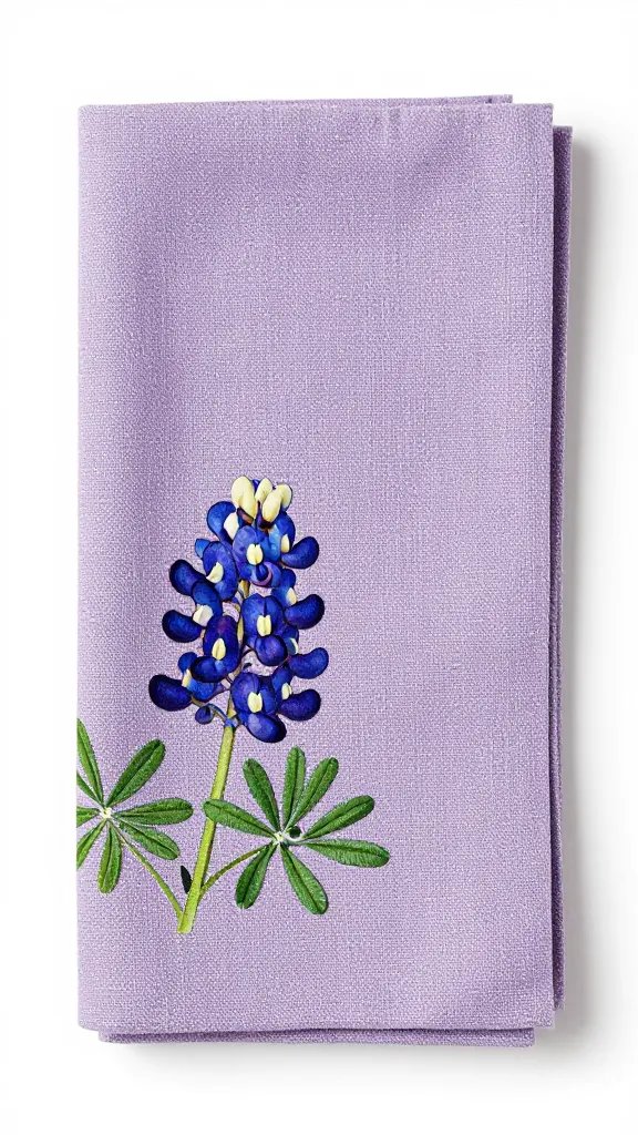
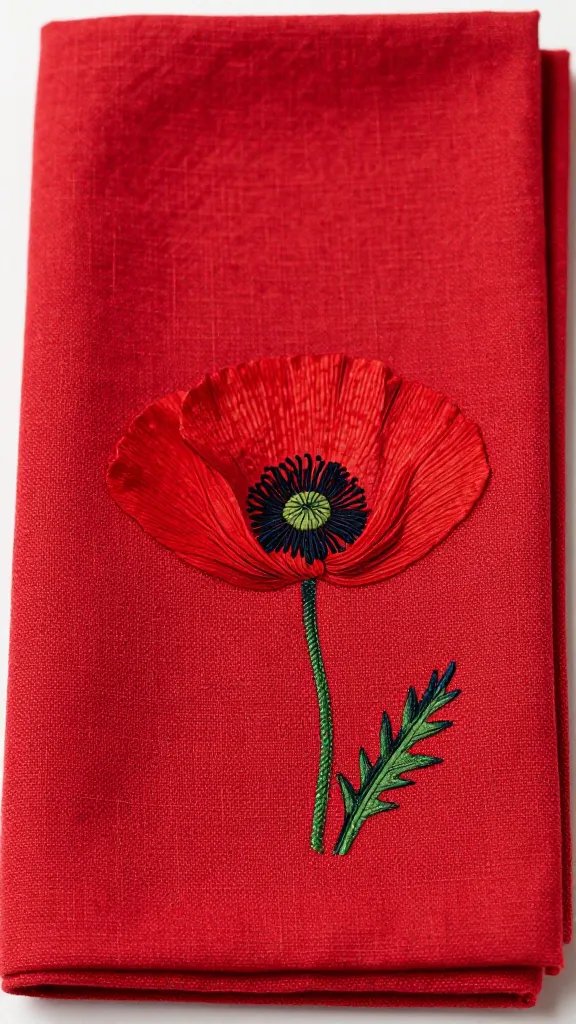
Two reds can fight each other if one leans blue and the other leans orange. I hold a white printer sheet behind a petal; if the color looks rosy or bluish, it’s cool. If it looks tomato or coral next to white, it’s warm.
Pick napkins with the same undertone as the bloom you’re echoing. A cool cornflower blue pairs with slate, gray, or crisp white. A warm California poppy orange loves cream, sand, or camel.
Action today: Do the white-paper test on one bloom photo and label it “warm” or “cool” in your phone notes; shop that lane only.
Season-by-Season Palettes You Can Assemble From a Garden Centre
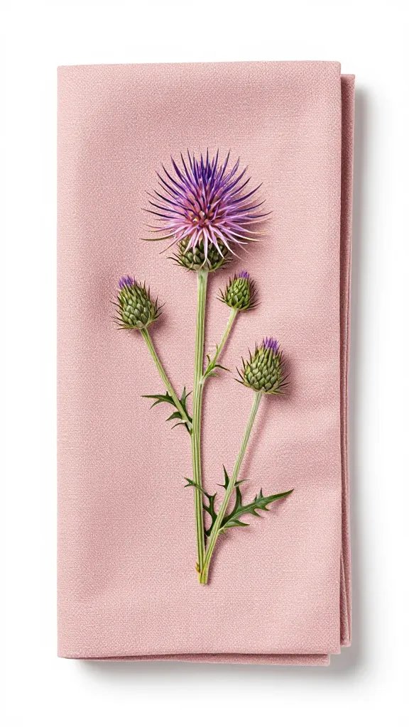
These are plug-and-play stacks built from common wildflowers and off-the-shelf linens you’ll find at any home or garden retailer.
Spring: Tender Greens and Clear Pastels
- Wildflowers: Bluebonnet, cherry blossom, woodland violet, primrose.
- Linens: Neutral: soft white or pale oatmeal. Mid-tone: cornflower blue or lilac. Accent: butter yellow ribbon or twine.
- Why it works: Spring light is cool and clean, so clear pastels feel alive rather than faded.
Action today: Pair pale oatmeal napkins with a single cornflower-blue napkin layered diagonally at each setting to introduce spring contrast.
Summer: Saturated Blooms, Sun-Baked Neutrals
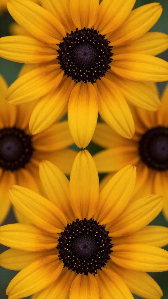
- Wildflowers: Black-eyed Susan, cosmos, bee balm, cornflower.
- Linens: Neutral: natural flax or tan. Mid-tone: marigold, fuchsia, or sky blue. Accent: black or deep brown napkin ring to echo seedheads.
- Why it works: Strong sun supports bolder color without looking heavy.
Action today: If your flowers are hot pink or orange, ground them with tan napkins and a thin black ribbon to prevent visual “sugar rush.”
Autumn: Burnished Tones and Earthy Contrast
- Wildflowers: Goldenrod, asters, late sunflowers.
- Linens: Neutral: chestnut or rust runner. Mid-tone: golden yellow or dusty purple napkins. Accent: olive green twine or napkin ring.
- Why it works: Lower sun angle makes warm, muted colors look rich instead of dull.
Action today: Fold mustard napkins into simple rectangles and add a sprig of dried aster under an olive twine knot.
Winter: Seedheads, Evergreens, and Crisp Contrast
- Wildflowers (dormant cues): Dried grasses, seedheads, pine tips, hellebore, early snowdrops.
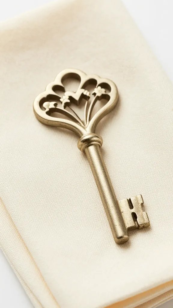
- Linens: Neutral: charcoal or crisp white. Mid-tone: forest green or deep plum. Accent: linen-beige or metallic brass ring.
- Why it works: With fewer petals, structure and contrast matter more.
Action today: Use charcoal napkins with a short evergreen clipping tucked under a brass ring to echo winter texture.
Build a 6-Napkin Capsule That Works Year-Round
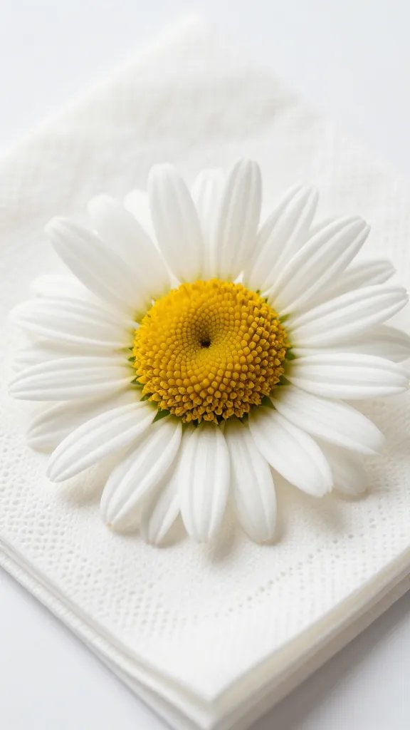
I keep six cloth napkins that cover every season: oatmeal, crisp white, flax tan, cornflower blue, mustard, forest green. They mix into the 60/30/10 formula without buying new pieces each month.
Add two ribbons: black for summer seedhead contrast and olive for autumn. Both come from any craft aisle and store flat in a drawer.
Action today: Audit your drawer and list the missing one or two colors that would complete this six-pack.
Use Simple Tests to Avoid Color Clashes
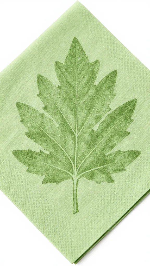
I lay one napkin on a plain plate and drop a single bloom on top. If the flower looks dull, the napkin is too close in value; if it looks loud and cheap, the undertones disagree.
At home, snap a phone photo in window light and convert it to black-and-white. If napkin and flower collapse into the same gray, add either a darker accent ring or swap in a lighter neutral to restore contrast.
Action today: Do the black-and-white photo test on your current setup and adjust one item a single step lighter or darker.
Practical Sourcing and Care From a Garden Centre or Hardware Store
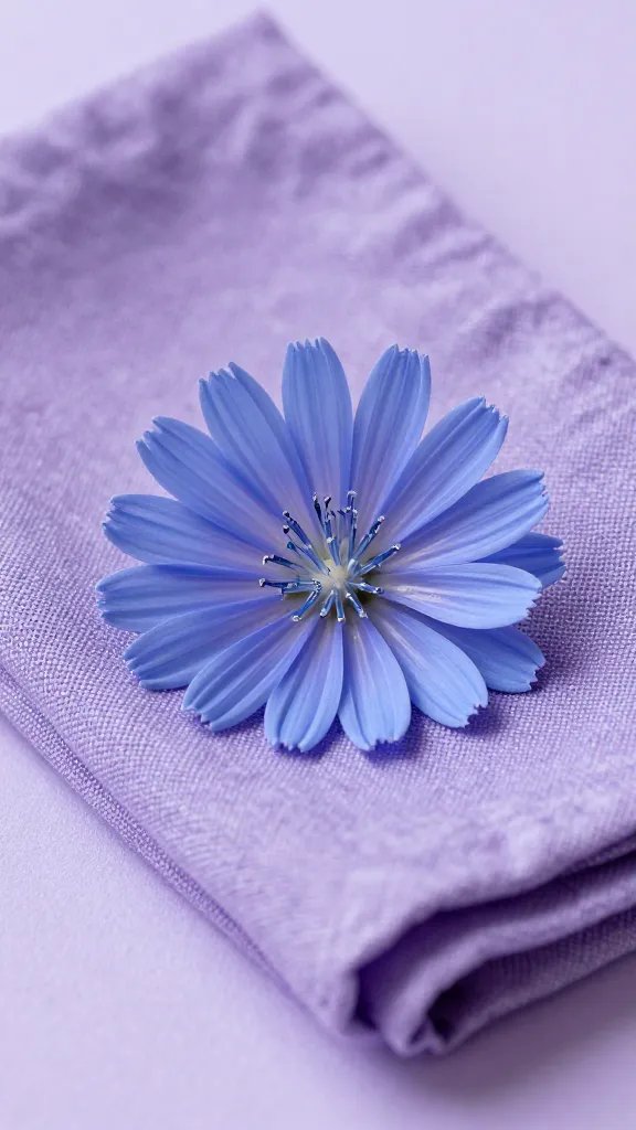
I buy plain cotton or linen blends in solid colors; they wash well and don’t fight the flowers. If the exact hue isn’t available, pick the right undertone first and the closest depth second.
For napkin rings, I use jute twine, thin leather cord, or simple brass washers from a hardware aisle. They echo stems and seedheads without stealing attention from the blooms.
Action today: Add one roll of jute twine and a pack of brass washers to your next hardware run — instant, season-proof accents.
Frequently Asked Questions
What if my local wildflowers aren’t sold at the market?
Use your photos as color guides rather than buying the exact species. Choose market flowers in the same hue and undertone, then style with foliage or seedheads you can gather legally from your yard. The palette match is what sells the look, not botanical accuracy. Keep the 60/30/10 ratio so the table still feels composed.
How do I keep bright napkins from staining during outdoor meals?
Pre-treat new napkins with a cold-water wash and a cup of white vinegar to help set dye. During meals, keep a small spray bottle with diluted dish soap at the sink; spritz stains within 15 minutes, then rinse cold. Wash on cold and air-dry to prevent setting. Store a couple of darker, seedhead-friendly napkins for barbecue or tomato-heavy menus.
Can I mix patterns with wildflower-inspired colors?
Yes — keep only one patterned item per place setting. If you use patterned napkins, make the tablecloth solid and choose a pattern that repeats one bloom color plus a neutral. Check that the pattern’s undertone matches your flowers before committing. The black-and-white photo test will confirm you still have enough contrast.
What if my table or plates already have strong colors?
Let existing strong colors act as your mid-tone and make napkins the neutral. For example, with blue plates and red cosmos, use oatmeal or flax napkins and a thin black ribbon to connect to seedheads. If the table is dark wood, skip a dark runner and bring in lighter napkins for lift. Keep the accent small so the scene doesn’t get crowded.
How many napkins do I need for a small apartment?
Six is enough: two light neutrals, two warm mid-tones, and two cool mid-tones. This set covers all seasons and most flower palettes without storage headaches. If space is tight, store ribbons and rings in a zip bag inside your napkin stack. Replace the most-used neutral every 18–24 months to keep whites crisp.
Conclusion
You don’t need designer linens to make a table feel intentional — you need to echo what’s blooming right now. Start with three local wildflowers, match undertones, and plug them into the 60/30/10 framework with a small six-napkin capsule. Tonight, set one place using the black-and-white photo test and adjust a single step lighter or darker. You’ll see how quickly the whole table snaps into season-aware harmony.
Leave a Reply