Steal These 5 Color Palettes for a “Moody Blue” and “Vintage Pink” Picnic Setup
· Yogi
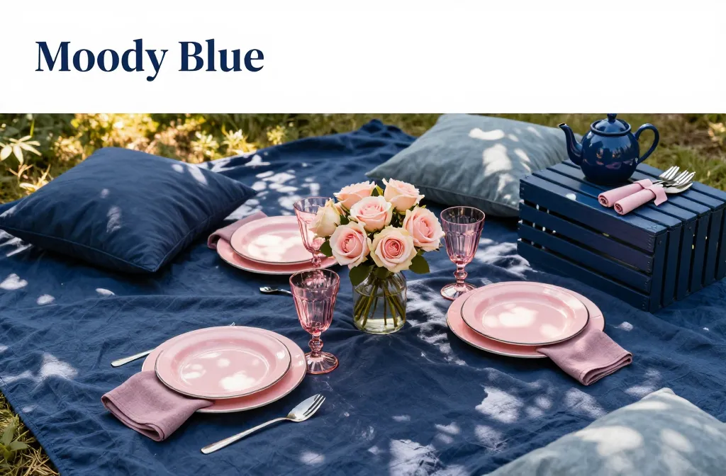
I host backyard picnics on a small patio and learned fast that color choices make or break the mood and the photos. When I paired deep blues with dusty pinks, everything finally looked intentional, not mismatched. In this guide, I’ll share five tested palettes, the exact items to pull from a garden centre or hardware store, and how to layer textures so your setup feels cozy and looks cohesive. You’ll walk away with ready-to-shop color combos and simple placement tips you can use this weekend.
How “Moody Blue” and “Vintage Pink” Work Together
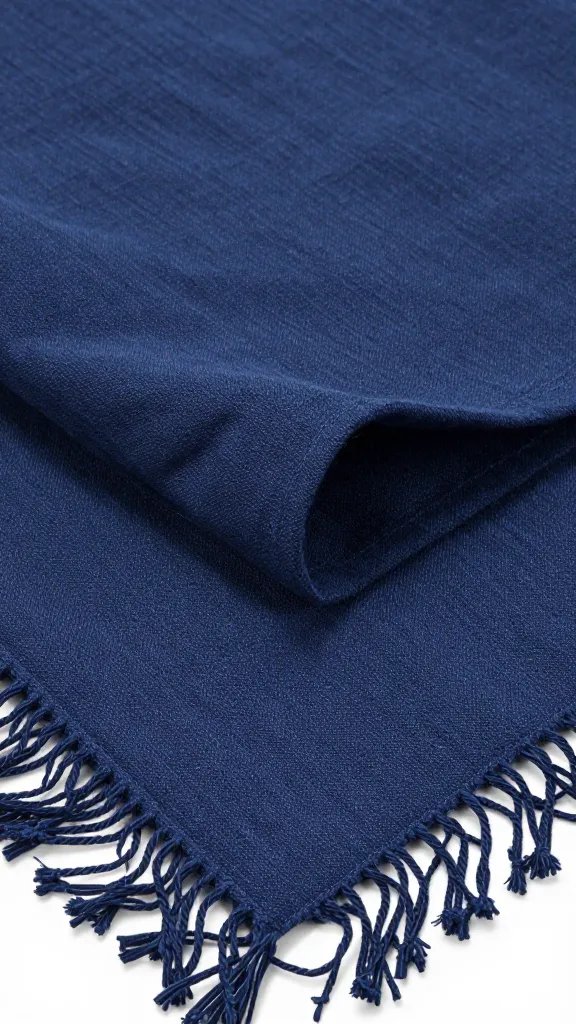
Moody Blue brings depth and calm. Think inky navy, stormy slate, and midnight teal — colors you’d see at dusk. They ground the scene and hide scuffs on picnic blankets and crates.
Vintage Pink is soft and nostalgic. Look for blush, rose, and faded mauve — not bubblegum. These tones echo old enamelware and heirloom roses, which makes everything feel collected, not brand-new.
Together, they balance contrast and warmth. Blue cools the palette so it doesn’t feel sugary; pink lifts it so it doesn’t feel heavy. I keep blue as the base (big surfaces) and pink as the accent (small items).
Action today: Pull one large blue item you already own (blanket, tablecloth) and one small pink item (cloth napkins, ribbon) and set them side by side in daylight; if the pink looks dusty next to the blue, you’re on the right track.
Palette 1: Dusk Garden (Navy, Dusty Rose, Sage, Cream, Charcoal)
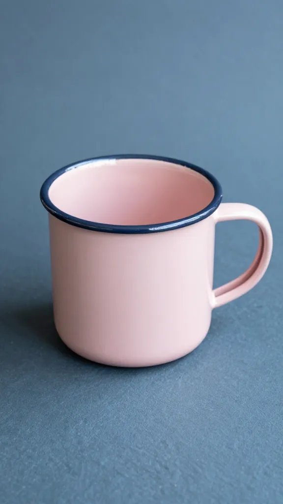
This palette feels classic and tailored. Navy anchors the blanket or tablecloth. Dusty rose shows up on napkins or a small vase. Sage and cream soften the contrast, while charcoal ties metals and crates together.
What to Use
- Textiles: Navy picnic blanket; dusty-rose cotton napkins; cream cushion covers.
- Serveware: White enamel plates; charcoal metal tray; clear glass tumblers.
- Greenery: Potted sage or eucalyptus from the garden centre for centerpieces.
Action today: Wrap a small sage plant in cream paper and twine for an instant centerpiece that bridges blue and pink.
Palette 2: Stormy Shore (Slate Blue, Vintage Pink, Warm Sand, Weathered Wood, Soft Black)

When you want moody without formal, this mix leans coastal and relaxed. Slate blue has a gray undertone that keeps reflections gentle in photos. Vintage pink napkins or ribbon add romance without glare.
Step-by-Step Layout
- Base: Slate-blue table throw or bedsheet.
- Surfaces: Weathered-wood crate as a low table.
- Neutrals: Warm-sand linen runner or tea towel across the crate.
- Accents: Vintage-pink napkins; soft-black cutlery.
- Detail: Seashells or pale gravel in a jar as a paperweight.
Action today: Sand a scrap wood board lightly and rub with a bit of cooking oil to fake a weathered serving board that matches this palette.
Palette 3: Night Orchard (Midnight Teal, Faded Mauve, Olive, Brass, Porcelain White)
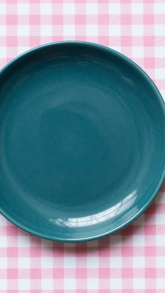
This reads lush and slightly glamorous. Midnight teal feels botanical and pairs naturally with olive foliage. Faded mauve lifts the scene, while brass details add warmth that flatters skin tones in photos.
Plant and Prop Pairings
- Plants: Potted olive or rosemary topiaries; trailing ivy in a brass-look pot cover.
- Props: Brass candlesticks (no-drip taper candles); white porcelain plates.
- Textiles: Teal throw; mauve ribbon around jars; olive napkin rings (use garden twine).
Action today: Spray-paint an old jar lid with “brass” metallic paint for a quick accent that repeats the warm metal note.
Palette 4: Blush & Ink Cottage (Ink Blue, Blush Pink, Terracotta, Moss, Natural Linen)
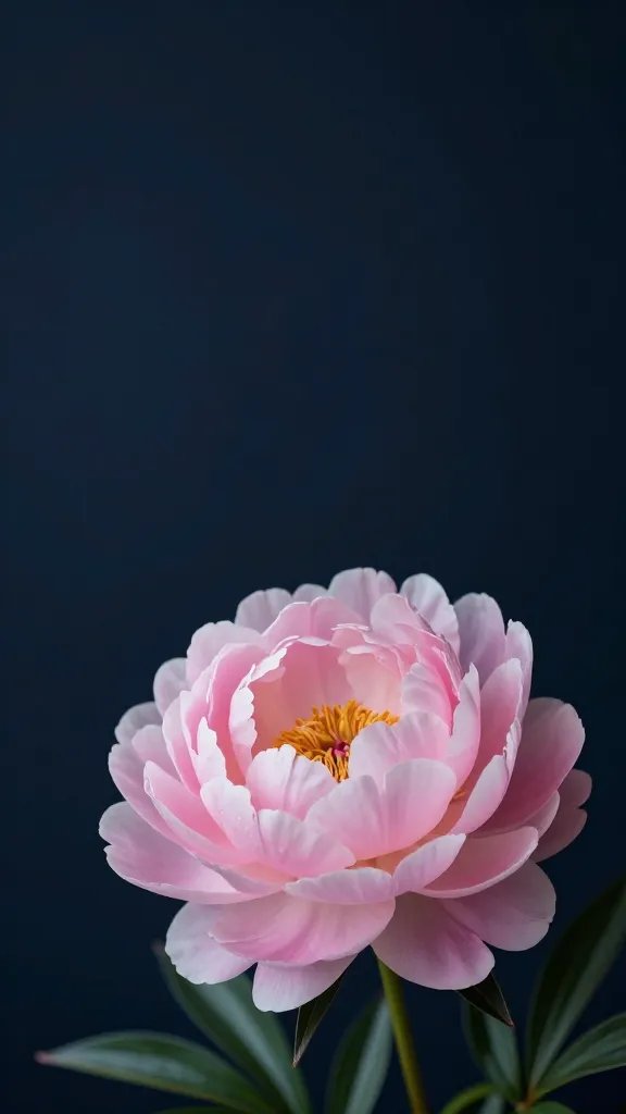
This palette feels cottagey and handmade. Ink blue provides the moody base. Blush pink stays airy, and terracotta pots introduce earthy texture that keeps the look grounded.
Warning Signs and Fixes
- Too sweet? Add more ink blue in one large field (blanket) and drop bright pinks.
- Too flat? Add moss texture: line a tray with sheet moss or tuck a mossy stone in a pot.
- Clashing tones? Keep pinks with a beige base, not white-based bubblegum shades.
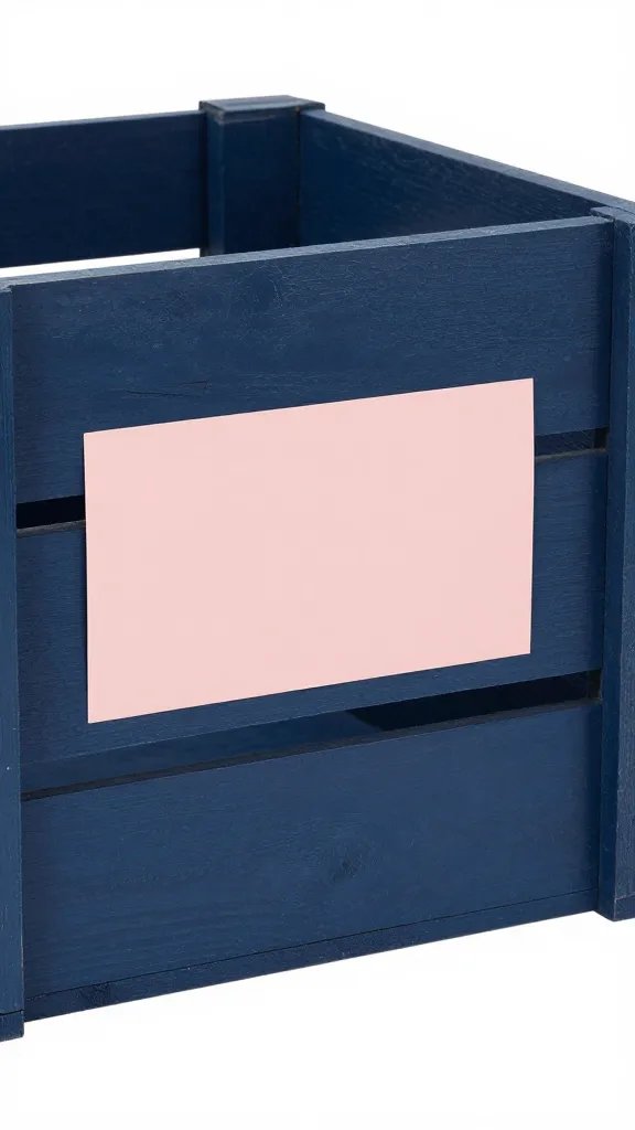
Action today: Slip terracotta pots into a shallow wooden fruit crate and tuck moss around them for a centerpiece with instant texture.
Palette 5: Twilight Parlor (Prussian Blue, Antique Rose, Pewter, Smoky Glass, Soft Ivory)
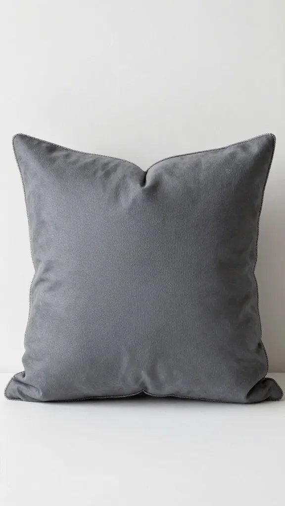
This one leans vintage-parlor and works well for evening. Prussian blue is strong enough to carry candlelight. Antique rose looks intentional next to pewter flatware and smoky glass tumblers.
Material Recommendations
- Glass: Grey or amber tumblers from the home aisle to cut glare.
- Metals: Pewter-look utensils or matte stainless (avoid mirror shine).
- Textiles: Ivory lace or crochet runner over blue to add visual break.
Action today: Tint clear jars by swirling a teaspoon of brewed coffee inside, rinse, and dry; it leaves a subtle “smoky” patina that suits this palette.
Make Colors Read True in Real-World Light
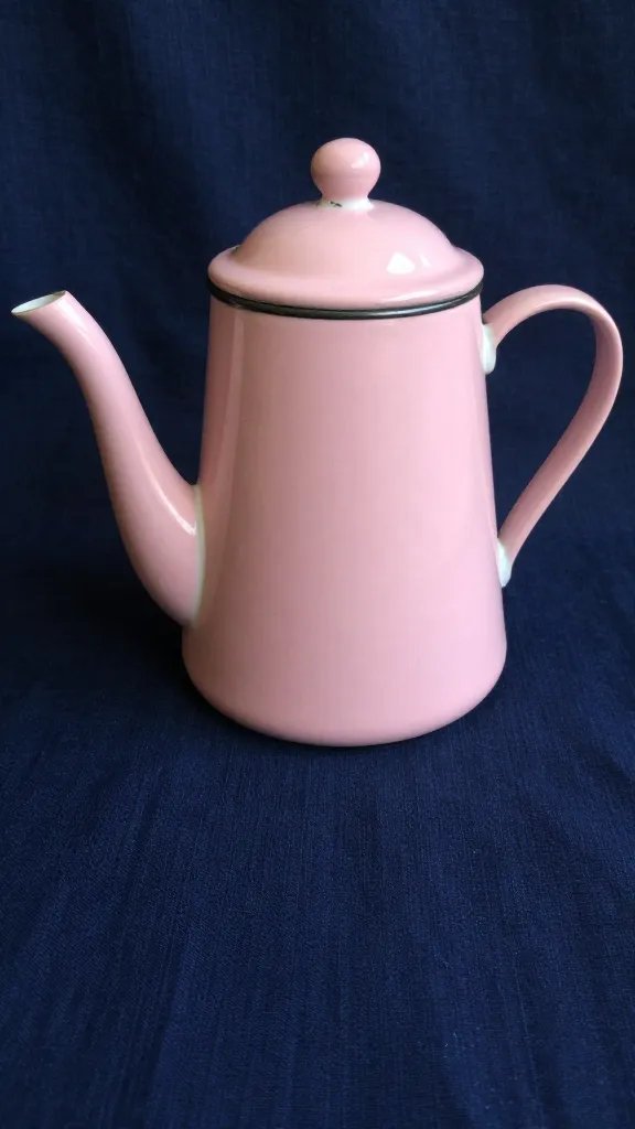
Outdoor light shifts fast. I test the setup at the same time I plan to eat. Direct midday sun can wash out pinks and make blues look harsh; open shade or an hour before sunset gives balanced color.
I avoid glossy plastics. Matte finishes on ceramics, fabrics, and painted wood keep reflections soft. If you only have shiny pieces, break up the glare with a linen napkin or a paper doily under each plate.
Action today: Move your setup 1–2 meters into open shade and take one photo; if pinks stop blowing out and blues deepen, you’ve found the right spot.
Simple Shopping List You Can Find Locally
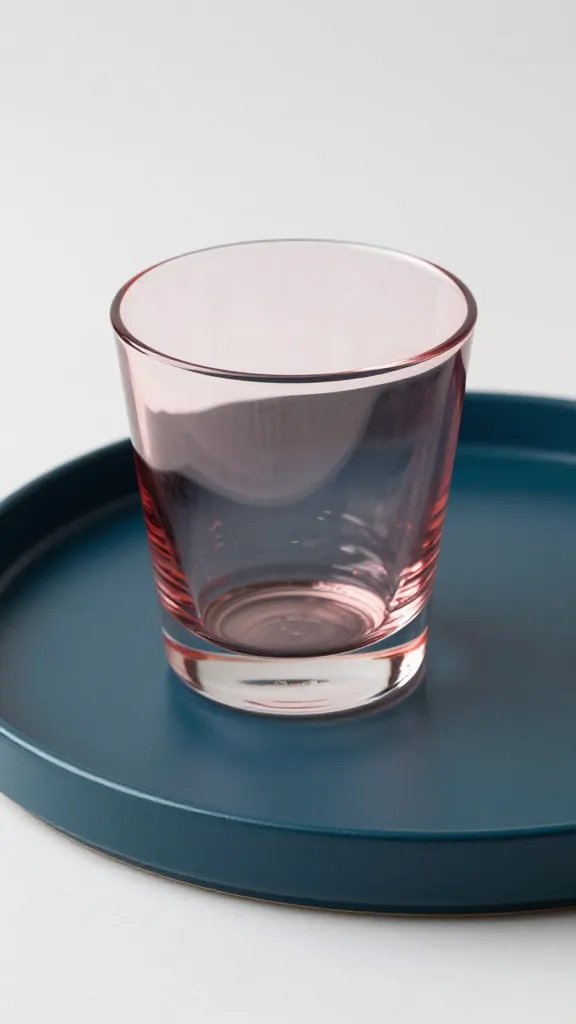
You don’t need specialty decor. I’ve built all five palettes with standard items from a garden centre and hardware store. Prioritize textiles first, then one metal, one wood, and one plant to add life.
- Textiles: One dark blue throw or tablecloth; one set of blush/dusty-rose napkins or a tea towel.
- Surfaces: Wooden crate or board; terracotta pots; a cream or linen runner.
- Serveware: White enamel plates; matte cutlery; clear or smoky tumblers.
- Plants/Greenery: Eucalyptus stems, rosemary, sage, ivy, or a small olive; twine for tying.
- Details: Candles (unscented tapers), ribbon (mauve/rose), kraft paper, moss sheet.
Action today: Choose one palette above and circle five items from this list to source on your next errand; stop when the cart has one blue base, one pink accent, one neutral, one plant, and one texture.
Frequently Asked Questions
How do I stop the picnic from looking mismatched if I mix old and new pieces?
Repeat each color at least twice. If you bring a navy blanket, add a navy ribbon around jars or a navy-striped tea towel. Keep metals consistent—either all brass/pewter or all black. Repetition makes thrifted and new items feel intentional.
What flowers work best with moody blue and vintage pink without overspending?
Use grocery-store spray roses in dusty pink, waxflower, and a bundle of eucalyptus. Tuck blooms low in small jars so they read as color spots, not a big mound. If roses run bright, tone them down with extra eucalyptus and skip additional pink items.
How do I handle wind so napkins and runners don’t fly off?
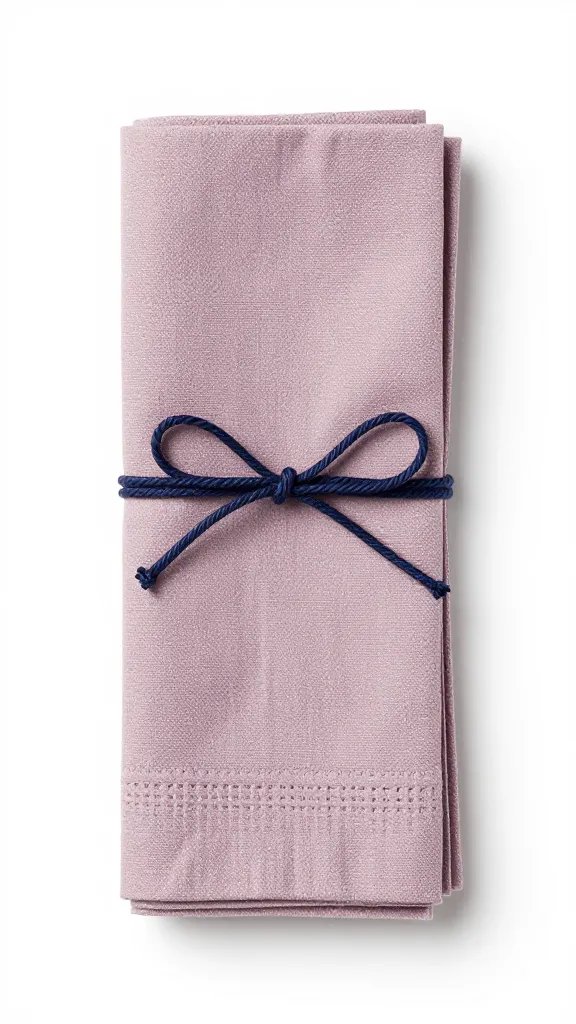
Use small terracotta pots, river stones, or filled jars as weights at the corners. Tie napkins with twine or a short strip of mauve ribbon. For runners, add discreet double-sided tape under the crate-edge or place a tray on top to pin it.
What lighting helps these colors look good after sunset?
Use warm white string lights or tea lights in jars. Avoid cool-white LEDs, which make pinks look chalky. Place two candles at table edges and one in the center; add a reflective metal (brass/pewter) piece to bounce light softly.
How do I clean and store textiles so the colors stay rich?
Shake off debris immediately and spot-treat stains with diluted dish soap. Wash dark blues in cold water with a color-care detergent, and air-dry flat to prevent fading. Store napkins and runners folded in a pillowcase away from direct sun.
Conclusion
Pick one palette, repeat each color twice, and ground everything with a moody blue base. If you start with textiles, add one plant, and choose a single metal, your picnic will look cohesive without designer gear. Today, choose your favorite palette above and set a five-minute mock layout on your floor—if it delights you indoors, it will sing outdoors.
Leave a Reply