12 Pink Picnic Set Up Ideas for a Blush Spread That Actually Comes Together
When I first tried planning a pink picnic, I spent hours chasing the perfect aesthetic and ended up with a collage of mismatched pieces. I’ve since learned practical, low-effort ways to assemble a cohesive blush spread using items a typical garden centre or hardware store carries. Below are 12 concrete ideas that actually come together, plus how to fix common pitfalls along the way.
1. Overreliance on Pure Pink: The Monochrome Mismatch
The blush palette often collapses into a flat, one-note display. If you only use pink, you miss texture, contrast, and visual interest that make a spread feel collected, not curated by accident.
Signs You’re Overdoing Pink
- Everything looks the same shade of pink from napkins to cups
- No variation in texture or height across the setup
- Items feel visually crowded on the blanket
How to Fix It
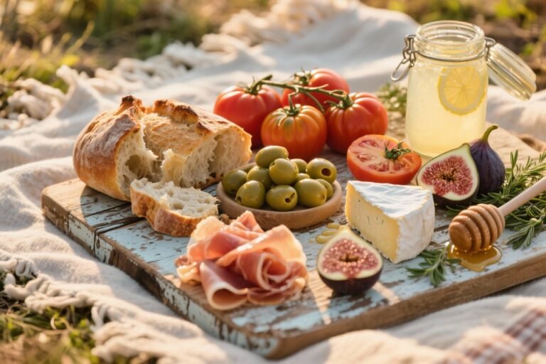
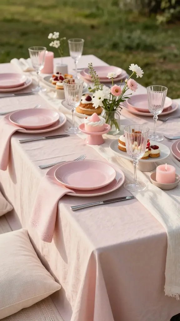
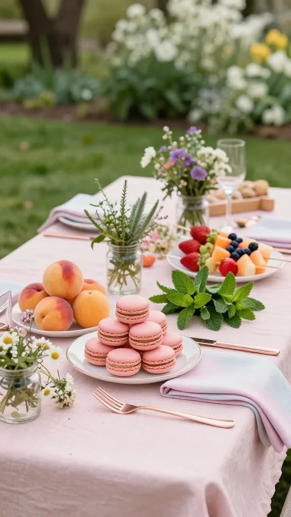
- Introduce three textures: matte ceramic plates, glassware, and linen napkins with subtle embroidery
- Incorporate two metallic accents (rose gold or brushed brass) and one natural wood piece
- Mix height with a small pedestal cake stand or a stack of vintage books as a riser
What to Use Instead
- A striped white-and-pink tablecloth or a light linen blanket
- Clear glass bowls for fruit, pale pink ceramic plates, and neutral napkins
- A small potted plant or bouquet with soft greens to break the pink
Takeaway: Build depth with at least three textures and two heights to keep the blush spread visually engaging.
2. Ignoring Sunlight: Pink Fades Fast
Direct sun can wash out pink tones and fade ripe fruit. A well-lit but shaded setup preserves color integrity and makes the spread feel intentional.
Signs of Too Much Sun
- Fruit looks sunburned or bleached colorwise
- Plasticware or paper napkins show yellowing or warping
How to Fix It
- Place the setup under a shaded patio or bring it indoors to bright indirect light near a window
- Use UV-protective napkins or fabrics if you must keep items outdoors
What to Use Instead
- A foldable shade screen or a light canopy
- Cloth napkins in a soft blush with a hint of ivory
Takeaway: Position the spread in bright indirect light to maintain color accuracy and freshness.
3. Inconsistent Color Temperature: Warmer vs Cooler Tones
Mixing warm pinks with cool pinks without a plan creates a chaotic, unpolished table. A deliberate temperature scheme keeps the spread cohesive.
Signs of Temperature Clashes
- Some items read peachy while others read pink-purple
- Plateware and textiles look clashed under the same lighting
How to Fix It
- Choose one main pink undertone (peachy blush or rosy pink) and stay with it across textiles, plates, and decor
- Limit accent colors to two neutral tones (cream and soft gray) to unify the palette
What to Use Instead
- If you pick peachy blush, pair with ivory napkins and light wood trays
- If you pick rosy pink, use off-white ceramic plates and brushed nickel cutlery
Takeaway: Pick a single pink undertone and carry it through all pieces for harmony.
4. Inadequate Layering: Flat, Uninviting Presentation
A picnic spread needs dimension. Without layering, the table feels like a casual snack instead of a planned moment.
Signs of Flat Layout
- Items sit on the blanket with equal visual weight
- There’s no central focal point or rhythm
How to Fix It
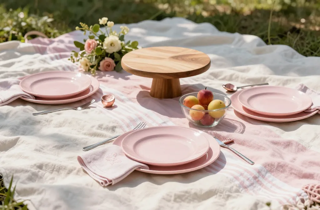
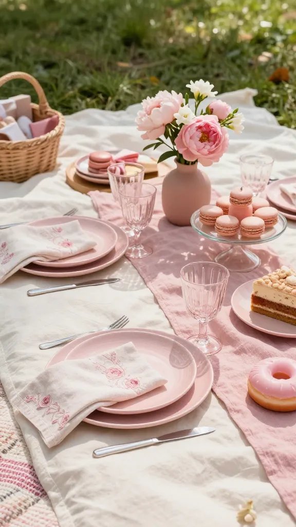
- Create a focal point with a small bouquet or cake stand centerpiece
- Layer textiles: place a patterned runner over the blanket, then a plain cloth on top
What to Use Instead
- A 12–14 inch cake stand as a blush centerpiece
- A woven placemat under the main dish to add texture
Takeaway: Layer at least two levels and one focal piece to anchor the arrangement.
5. Mismatched Serveware: Everyday Without Cohesion
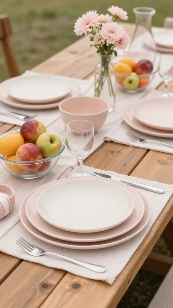
Using random cups and plates undermines the blush spread. Consistency in serveware makes the setup feel intentional.
Signs of Mismatched Serveware
- Different finishes (glossy vs matte) clash on the same table
- Plates and bowls are clearly from different sets or eras
How to Fix It
- Limit to two plateware finishes: matte ceramic for plates, glass bowls for fruit
- Coordinate with a unifying color thread in napkins or chargers
What to Use Instead
- Two complementary plate sets in ivory and blush, plus glass bowls
- Plain or lightly patterned napkins that tie into the main color
Takeaway: Use two harmonizing finishes and keep colors aligned to avoid visual discord.
6. Underestimating Practical Picnic Tasks: Food Safety and Flow
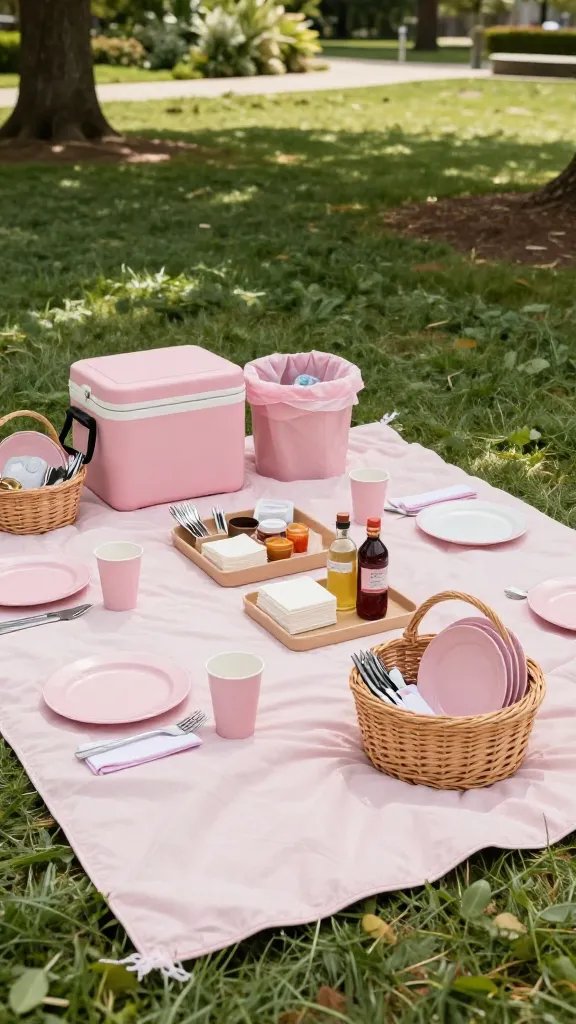
Practical steps often get overlooked in the pursuit of style. A good spread must be easy to serve, eat, and cleanup.
Signs of Poor Picnic Flow
- Food or drinks crowd the main area, forcing guests to reach across others
- No dedicated space for utensils, napkins, or trash
How to Fix It
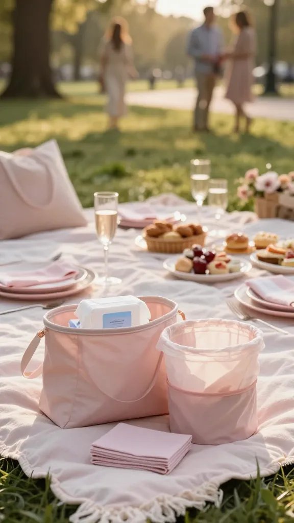
- Arrange a clear service zone with a small tray for utensils and a separate area for trash
- Keep perishables in a cooler or insulated bag off the main blanket
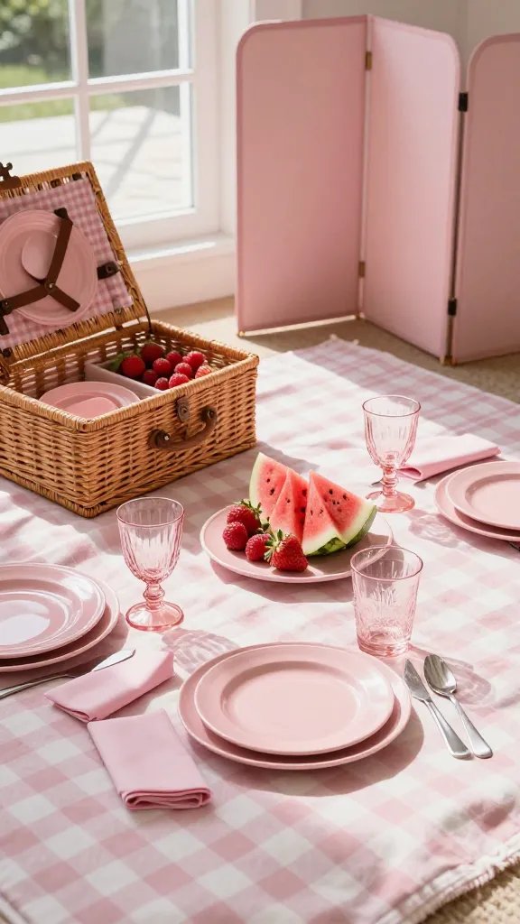
What to Use Instead
- Two small baskets: one for plates and cutlery, one for napkins
- A compact cooler bag or insulated container for dairy-heavy foods
Takeaway: Define a service line and separate cooling space to maintain safety and flow.
7. Weak Lighting: Pink Glow Vanishes at Dusk
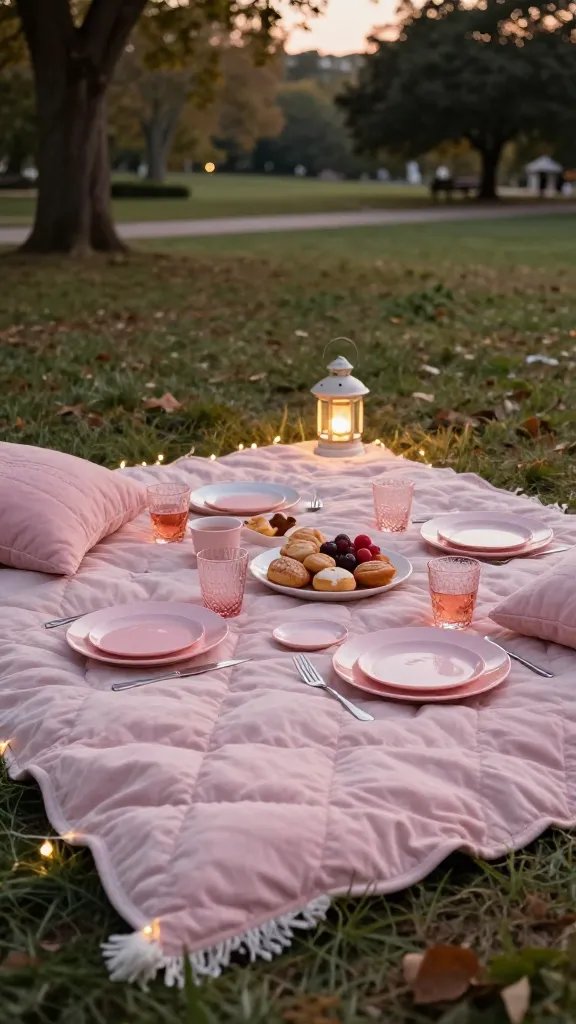
Even in a park, lighting affects how the blush looks. Poor light dulls colors and hides texture.
Signs Lighting Is Not Working
- Colors look dull or muddy as the sun sets
- Shadows obscure the edges of textiles and plates
How to Fix It
- Schedule the picnic to end before evening light fades or bring a battery-powered lantern
- Use candles in protective holders only if allowed and safe
What to Use Instead
- Fairy lights along the edge of the blanket or a small lantern to keep the blush tones true
Takeaway: Add portable lighting to preserve color and mood as daylight fades.
8. Too Much Waste: Single-Use Overload
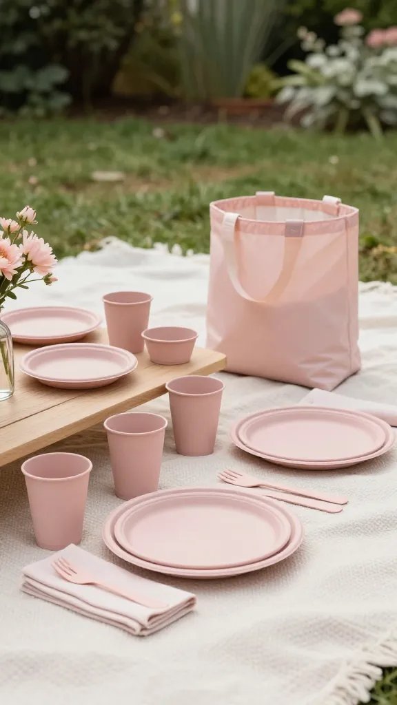
A stylish blush spread loses its charm when it’s littered with disposable waste. Practical choices save time and space.
Signs You’re Creating Excess Waste
- Plates, cups, and napkins are all disposable in different brands
- Cleanup becomes a mess due to insufficient containers for recyclables
How to Fix It
- Limit to one set of compostable or reusable dishes and cups
- Bring a small waste bag and a separate bag for recyclables; plan for disposal in a nearby bin
What to Use Instead
- Two sets of blush-colored reusable dishes, plus a reusable water bottle
- Backup cloth napkins you can wash after the event
Takeaway: Use reusable items when possible to keep the look polished and the cleanup simple.
9. Inconsistent Spacing: Uneven Blankets and Surfaces
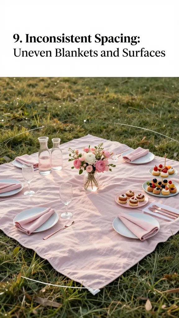
Spacing matters. Too tight a setup feels cramped; too spread out looks sparse.
Signs of Poor Spacing
- Items crowd the center while edges feel empty
- Guests have to lean in to reach food or drink
How to Fix It
- Lay out a 6×6 foot area with a central focal point and evenly distribute items around it
- Place drinks to the left, food to the right, and napkins in a dedicated corner
What to Use Instead
- A circular layout guide (improvise with a rope or string) to keep spacing consistent
- Two small, symmetrical decor items to frame the space
Takeaway: Create a balanced grid by spacing items evenly around a central point.
10. Fragile Decor: Breakage Risk Underfoot and Wind
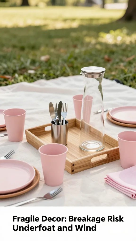
Delicate items crash and burn at picnics. A blush spread deserves sturdy accents that tolerate movement.
Signs That Decor Is Too Fragile
- Breakable glassware or porcelain items sit within easy reach of children or pets
- Decor elements may topple with even a light breeze
How to Fix It
- Use sturdy melamine or BPA-free plastic cups for outdoor use
- Secure centerpiece on a small tray to prevent tipping
What to Use Instead
- Sturdy stoneware plates in blush or ivory
- Silicone or cork coasters to dampen movement
Takeaway: Favor durable serveware and stable centerpieces to survive outdoor luck.
11. Neglecting Seasonal Touches: A Missing Moment
A blush spread feels thoughtful when it nods to the season, not generic and static. Small seasonal accents make the setup feel alive.
Signs You’ve Missed Seasonal Cues
- Decor and food choices feel generic and not time-bound
How to Fix It
- In spring, add light florals or herbs; in late summer, include pale peaches or apricots as accents
- Use a seasonal fruit display that enhances color but remains easy to eat
What to Use Instead
- Fresh mint sprigs for scent and color
- Seasonal fruit skewers (strawberries, melon, peach) in a pale blush dip bowl
Takeaway: Tie the palette to the season with small living accents and seasonal fruit touches.
12. Cleaning and Post-Picnic Care: The Afterglow Fade
A polished blush spread isn’t complete until you’ve planned clean-up. A messy exit undercuts the effort you put in.
Signs You’re Missing Aftercare
- Crumbs and spills are left on the blanket, attracting ants or dampness
How to Fix It
- Bring a damp cloth or wipes for quick tidy-ups and a trash bag
- Pack a compact bucket or bag for leftovers and used napkins
What to Use Instead
- A small, washable tote for dishes and wipes
- A dedicated corner for disposal away from food while guests mingle
Takeaway: Leave the space as you found it or better, with a quick, organized cleanup plan.
Frequently Asked Questions
How do I pick the best blush pink textiles for a picnic?
Choose textiles in a cohesive blush family—think champagne blush, rose, and ivory. Look for fabrics with a subtle texture, like linen or cotton, and avoid loud patterns that clash with your core tones. Bring a light outer layer if the day turns breezy.
What if it rains or gets windy?
Have a lightweight, water-resistant throw or a small canopy you can deploy quickly. Keep fragile items inside a bag and ready to move if weather shifts. Consider a backup plan to relocate to an indoor space if heavy rain hits.
What are budget-friendly centerpiece ideas?
Use a cake stand, a small potted plant, and a few sprigs of greenery from your place or a neighbor’s garden. A shallow dish of blush-tinged fruit adds color without cost. Reuse items from home to keep costs down.
How can I transport everything without tipping?
Pack items in two tote bags with dividers and use soft padding between pieces. Put fragile items in the middle of the bag, surrounded by soft fabric. Keep liquids in leak-proof containers in a separate cooler.
Is it okay to mix coolers with baskets?
Yes. Use a cooler for perishables and a decorative basket for non-perishables and decor. This separation keeps food safe and the display tidy. Label compartments to avoid mix-ups.
Conclusion
With these practical, proven tweaks, your 12 pink picnic ideas come together into a blush spread that feels deliberate, not accidental. Start with a single cohesive palette, add texture and height, and plan for flow and cleanup—then enjoy the moment you’ve created.