9 Ways to Make Ikea + Thrift Picnic Decor Look Like a Styled Shoot Now
Want Pinterest-level picnic photos without a stylist or a private orchard? Same. With a few clever upgrades, your IKEA basics and thrift treasures can look straight out of a magazine. These tricks focus on texture, height, color, and those tiny details that scream “editorial.” Let’s turn your casual picnic into a swoon-worthy moment, shall we?
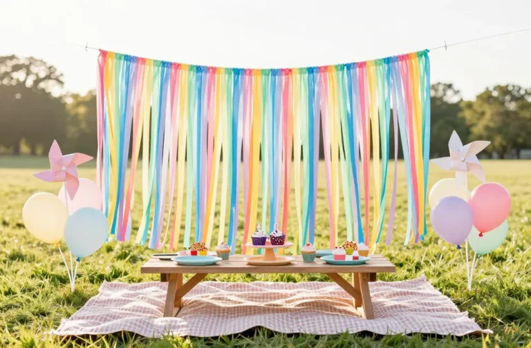
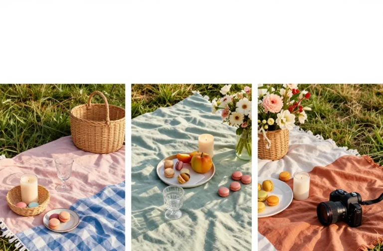
1. Build A Signature Color Story
Styled shoots always look intentional because the colors tell a clear story. Pick 2-3 anchor hues and stick to them like a theme song. Then add in one metallic or natural texture to tie everything together.
How To Choose
- Base neutrals: cream, sand, terracotta
- Two accents: sage + rust, blush + mustard, or navy + ochre
- Metal/texture: brass, rattan, or raw wood
Match your linens, glassware, and florals within that palette. FYI, tight palettes make thrift-store randomness look like a curated collection.
Use this approach whenever your haul feels mismatched—it instantly creates cohesion.
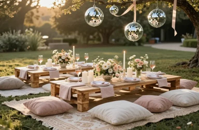
2. Layer Linens Like A Food Stylist
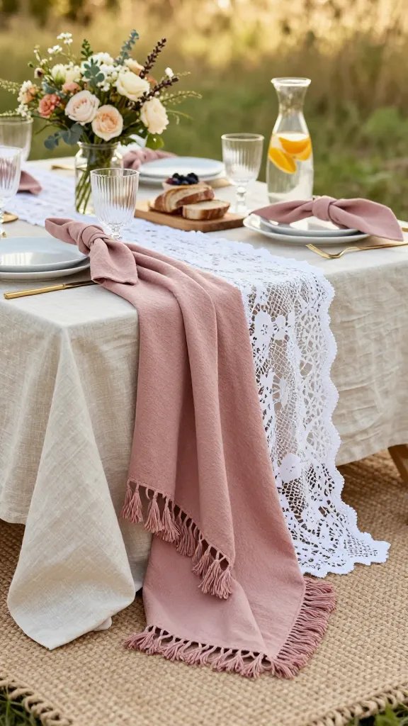
Flat blankets look flat in photos. Create depth with stacked layers: a base rug, a tablecloth, then a runner or folded throw on top. The textures do the heavy lifting and make budget fabrics feel luxe.
Materials That Always Work
- IKEA cotton or linen tablecloth (unironed = relaxed, steamed = polished)
- Thrifted lace curtain as a topper or runner
- Turkish towel with tassels for edge drama
Let the underlayer peek out 2-4 inches all around for dimension. Add a cheeky napkin knot at each place setting for a styled, non-fussy finish.
Perfect for windy days—the weight and layers keep everything put and photogenic.
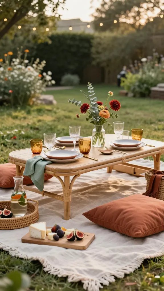
3. Create Height With Crates, Stacks, And Stools
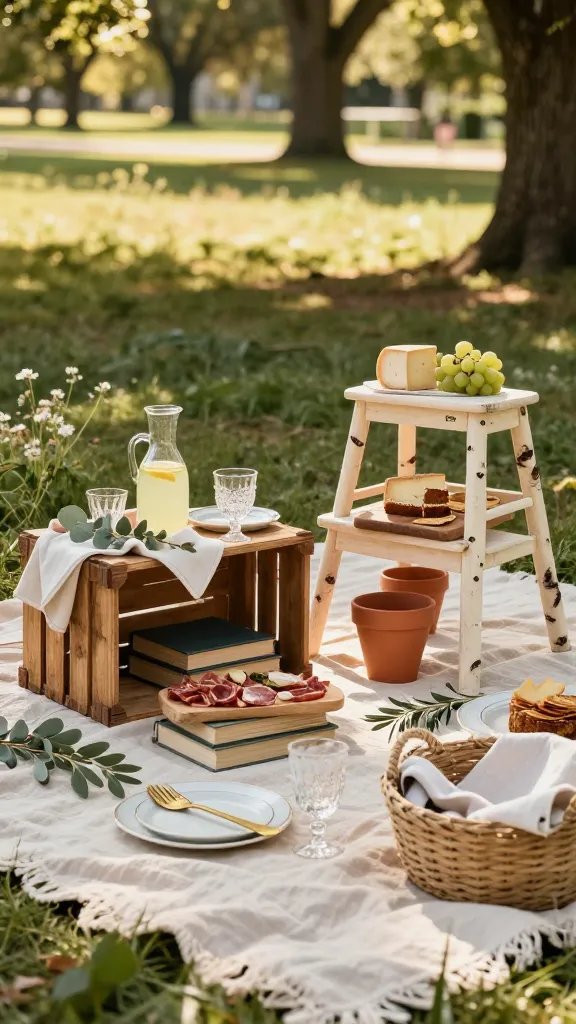
Editor trick: vary the heights so your eye dances around the scene. Low picnics can read flat, so cheat the system with smart elevation. You’ll make budget bites look like they came with a day rate.
Easy Elevation Ideas
- Flip a wooden crate as a mini table
- Stack hardcover thrift books under boards or platters
- Use IKEA stools (Bekväm) as cheese-board pedestals
- Upside-down plant pots under a cutting board for a cake stand
Hide the props with a napkin or greenery if needed. Your photos will get that editorial “layers on layers” look.
Use this when you have lots of small items—height makes simple spreads look abundant.
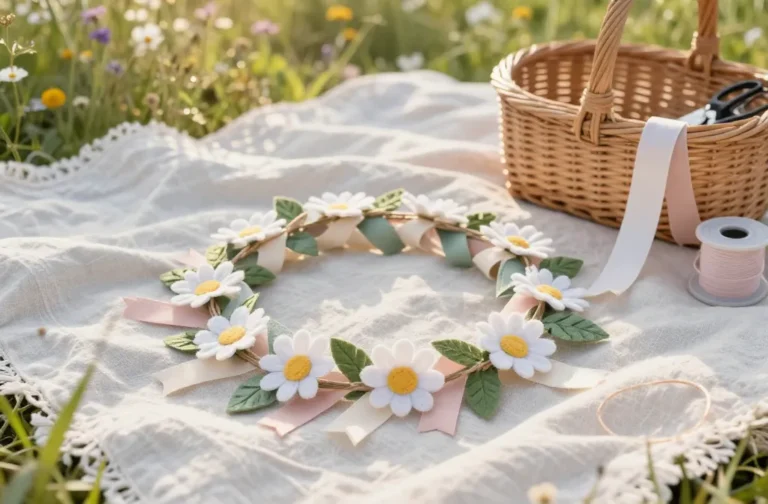
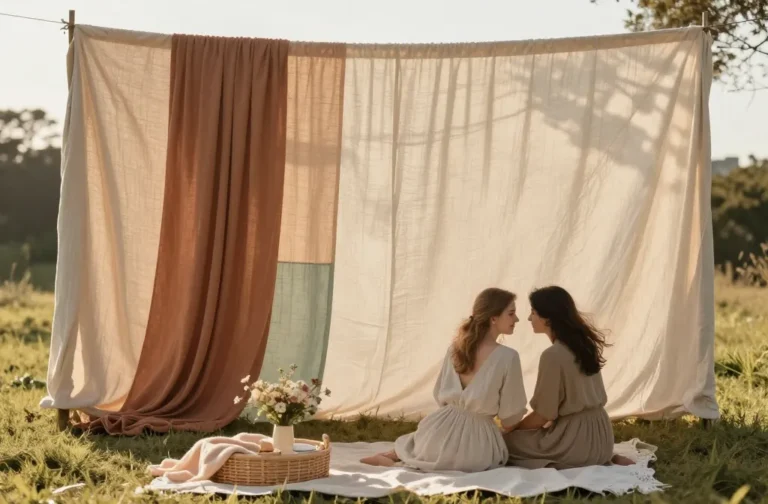
4. Mix Real Florals With Foraged Greenery
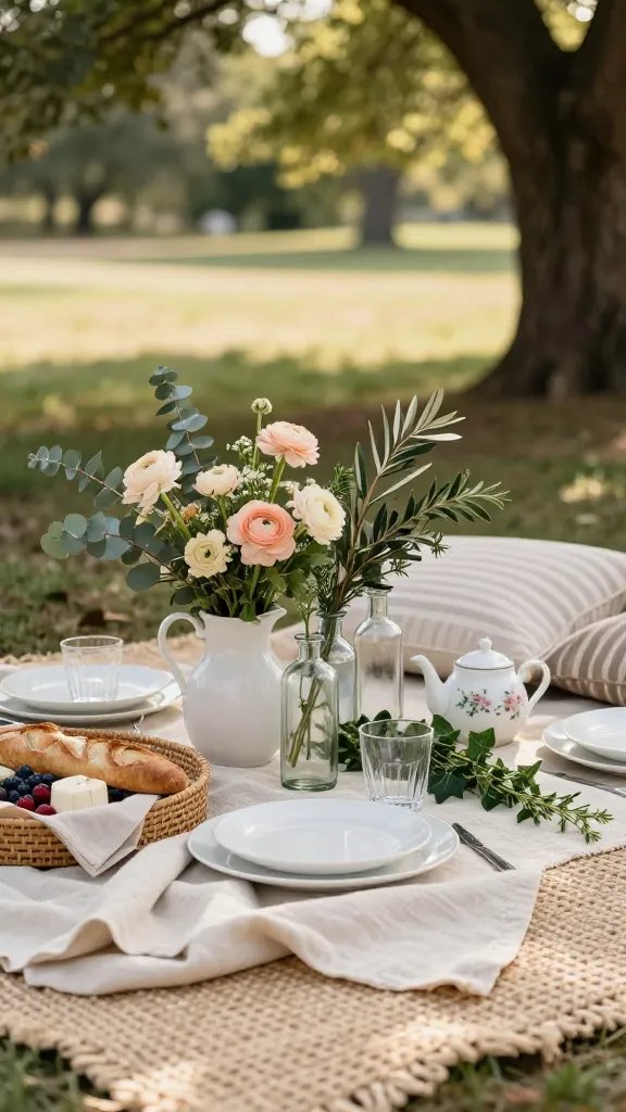
Flowers sell the fantasy, but you don’t need a florist. Pair one store-bought bouquet with clippings from your backyard or a park (responsibly, obviously). The contrast between delicate blooms and wild greens feels intentionally undone.
Tips For Effortless Arrangements
- Use a thrifted pitcher, teapot, or vintage bottle cluster as vases
- Stick to one or two flower types for simplicity (ranunculus, dahlias, spray roses)
- Add eucalyptus, olive branches, ivy, or rosemary for volume
Keep stems short and asymmetrical—styled shoots rarely go perfectly round. A sprinkle of petals or herbs on platters adds a chef’s-kiss moment, IMO.
Ideal for romantic setups and picnics with minimal decor—florals do the heavy lift.
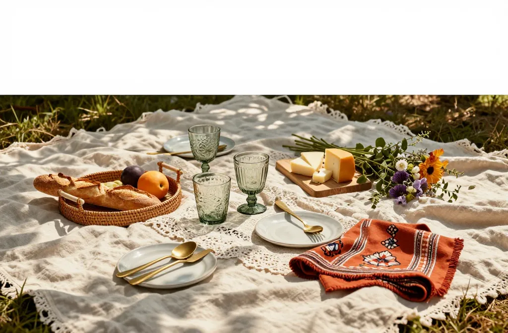
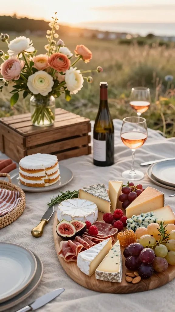
5. Curate A Photogenic Food Board (Even With Grocery Basics)
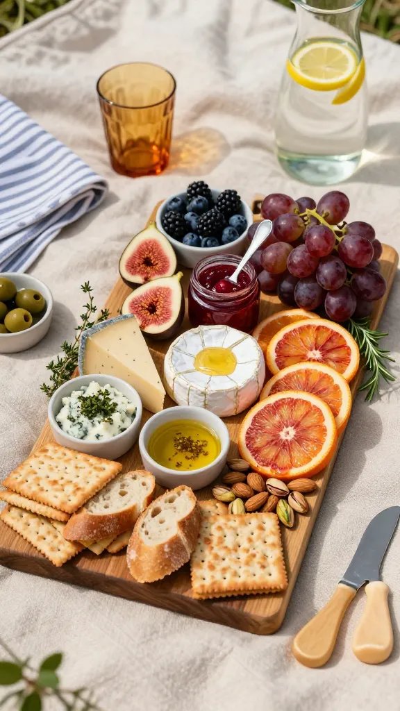
You don’t need a personal chef—just style like one. Arrange by color and texture, not category. Mix round with angular, soft with crunchy, and matte with glossy.
What To Include
- Cheeses with different shapes (wedge, round, crumble)
- Fruits by color blocks (figs, berries, grapes, sliced citrus)
- Crunch factor (crackers, nuts, bread ends)
- Glossy accents (honey drizzle, jam, olive oil)
Use small bowls for olives or dips to avoid chaos. Tuck herbs like thyme or rosemary around edges for that “food magazine” vibe. Trust me, it photographs way more expensive than it costs.
Great for group pics where the board becomes the centerpiece—maximum visual payoff.
6. Plate Like A Prop Stylist: Mismatch, But With Intention
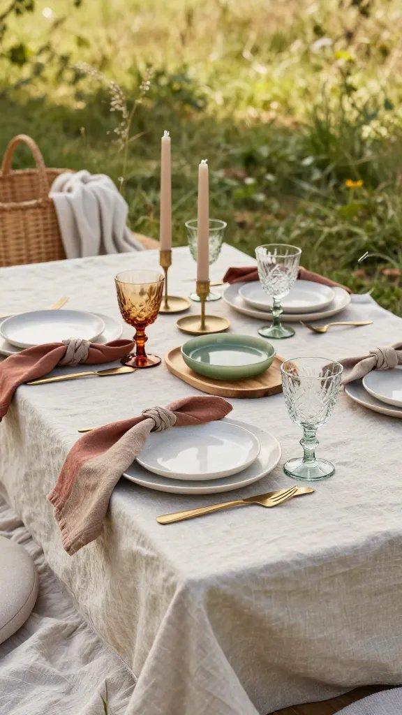
Perfectly matched sets can look stale. Mix thrifted plates, etched glassware, and IKEA basics to nail that lived-in editorial feel. The secret? Repetition and restraint.
Styling Formula
- Repeat one element three times (e.g., same goblet style in different colors)
- Keep shapes similar across mismatched plates (all round, for example)
- Use cloth napkins in your palette to tie it all together
Sprinkle in a few vintage utensils or brass candleholders for instant character. A single unexpected piece—a tiny silver salt cellar, a marble dish—reads editorial fast.
Use this when your collection feels chaotic—repeating one detail calms the look.
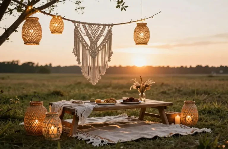
7. Light It Like A Movie Set (But Easy)
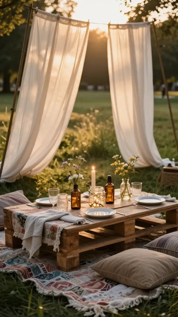
Lighting can make $20 decor look like $200, or vice versa. Aim for soft, directional light that flatters everything. Golden hour is your BFF, but you’ve got options.
Lighting Moves
- Golden hour start time: 60–90 minutes before sunset
- Use sheer thrifted curtains as DIY diffusers over harsh light
- Cluster candles in hurricane vases or jars to block wind
- Battery fairy lights in bottles for a twinkle without cords
Avoid overhead noon light if you can—it flattens colors and creates weird shadows. Even one large white throw held up as a reflector can bounce glow onto your table. Seriously, it’s magic.
Best for evening gatherings or photo-heavy moments when ambiance matters.
8. Tell A Story With Little Props And Paper
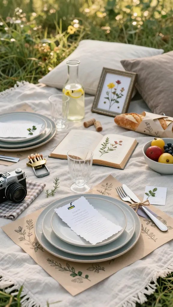
Styled shoots always have a narrative. Add tiny details that hint at a mood—romantic poetry book, vintage camera, handwritten place cards. These bits make people linger on your photos.
Small But Mighty Add-Ons
- Thrifted frames with pressed flowers as “art” on the blanket
- Hand-torn menu cards with watercolor edges
- Old-world bottle openers, matchboxes, or corks with dates written on them
- Ribbon-tied cutlery bundles using silk scraps or twine
Use kraft paper or parchment as placemats with sketched doodles or names. It feels intimate without trying too hard.
Perfect for birthdays, proposals, or memory-making moments where sentiment counts.
9. Finish With A Signature Moment (The “Hero” Shot)
Every styled shoot has one focal point that anchors the gallery. Choose your hero—a grand cheese board, a layered cake on a crate, a lush floral cluster—and design everything to support it. Then frame the scene like a photographer.
Composing The Shot
- Place the hero off-center (rule of thirds)
- Angle props to point toward it (knives, stems, handles)
- Add negative space with a solid cloth for breathing room
- Shoot from both overhead and 45 degrees for variety
Spritz fruit with water for a dewy look. Wipe plates, fluff linens, and nix any plastic packaging lurking in the background. Little cleanups make the biggest difference, FYI.
Use this trick for social posts—you’ll get that “oh wow” scroll-stopper every time.
Ready to upgrade your picnic game? With a tight color story, layered linens, clever height, and a few secret props, your IKEA finds and thrift gems can look outrageously chic. Now grab your blanket and go make the park your personal studio—no stylist required.